When it comes to designing a website as an artist, it can be challenging to find inspiration that fits your unique style.
Combining your style with good marketing functions can sometimes be a bit tricky.
However, with the right resources and guidance, you can create a website that showcases both your work and your style. In this article, I’ll share some website design inspiration for art businesses that will help you create a website that stands out from the rest.
Function First: The E-Myth Conundrum
It’s possible that building a business in the arts can give you the life of your dreams. Find out more in 8 Reasons To Start A Creative Home Business.
But there’s a formula. Let’s look at a story about an artist starting her business.
Jane makes modern home decor sculptures. Whenever people see her work, they go crazy for her whimsical style and unique pieces!
So, Jane decides to make a lot of her one-of-a-kind sculptures and finally start a business. She’s tired of putting her dreams aside and commits to focusing on starting her art business.
She starts by building her own website, drawing on her personality and her style, and after spending a lot of time putting it together, it’s finally live and she’s ready to sell.
Weeks go by.
Nobody is buying.
But everybody raved about her work! What’s happening??
This is the E-Myth conundrum.
The idea that you have the skills that add value but don’t have the skills to market and sell them.
People who have a unique skill set, service or product often try to create their own business but struggle because they don’t have the business skills they need to run their business. This rule applies to every aspect of business. Marketing, sales, budgeting, content creation, customer service, and website design all follow a formula that make them work well.
So, as a rule, function is always first when it comes to designing a website!
Naturally, style is important. But, it comes second.
You can have a profitable business with function and no style. But you’ll have a tough time building a business with style, but no function.
So the sites I’ll be listing as my picks for website design inspiration will incorporate both.
Finding Inspiration
One of the best places to start looking for website design inspiration is by browsing other successful artists’ websites.
As an artist, your creativity will allow you to build something pretty.
But you must build a site with good marketing and sales practices which should follow principles of understanding the customer journey.
By analyzing some well designed sites for website design inspiration, you can get a better understanding of how to design your own website and what elements you should include.
One other great source of inspiration is to look at design blogs and websites that specialize in website design. These websites often showcase the latest trends and techniques in website design, which can help you stay up to date with the latest design practices.
Start By Understanding Your Customers First
Creating your layout and design should speak directly to your customer first.
As an artist, you want your website to reflect your unique style and vision, of course. But laying out the elements that attract the right person to click through your site is key.
Artist, Matt LeBlanc does this well. And coincidentally has a background in marketing.
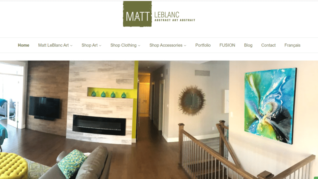
https://www.mattleblancart.com/
As soon as you land on his site, you know exactly who he is, the type of art he does and the products he sells.
His simple, clean and abstract style is clearly portrayed. The image of his work hanging in a contemporary house speaks to the type of customers that he generally sells to.
The navigation at the top of this page tells you what he sells, his bio is placed right below this image (when you scroll down), and the categories and featured sections below that showcase his work and popularity.
Simple, clean and beautiful.
Website Design Inspiration And Website Elements
To create a website that truly reflects your artistic style, it’s important to add your style into each element. But, since how you create a high performing website depends on funtion first, consider the following design elements after you’ve put thought into the outline.
Mood
Determine the mood of your art and use that to guide your website design. For example, if your art is moody and dark, or classic and clean, your website design should reflect those things as well.
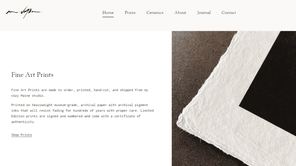
Texture
Incorporate some designs that reflect some of the textures in your art. This helps to create a cohesive look throughout your website.
For example, Kelly Ray Robert’s site has a bright, playful look with a texture throughout her site that matches her paintings.
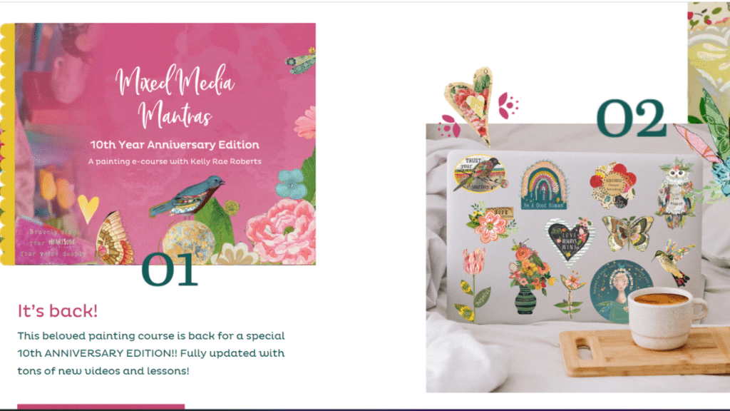
https://www.kellyraeroberts.com/
Shapes
Use shapes that reflect the shapes in your art. This can create a visual connection between your art and website design.
Jessica Chou uses these wide, horizontal shapes to showcase the elegant, genuine style of her photos.
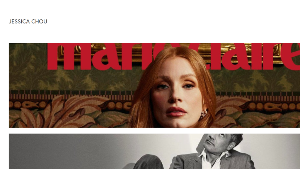
http://www.jessicachouphotography.com/
Patterns
Incorporate patterns that reflect the patterns in your art. This can create a unique and cohesive look throughout your website.
In this beautiful site, the patterns are repeated throughout – including on the opt-in forms.
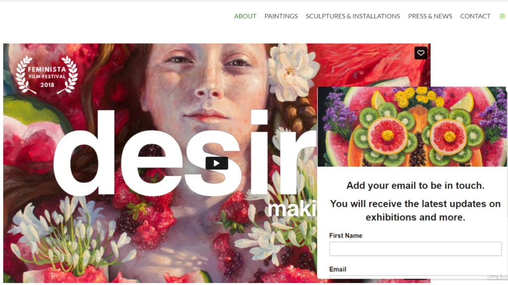
https://www.alonsaguevara.com/
By interpreting your artistic style into web elements, you can create a website that truly reflects your unique vision as an artist.
Connecting Art and Web Design Functionality
Your website design should be an extension of your art
It should showcase your work in a way that complements and enhances your style. To achieve this, consider the following:
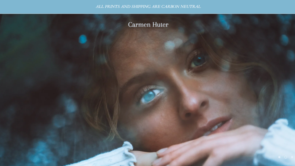
Color Scheme
Choose brand colors that reflect your artistic style and create a cohesive look throughout your website.
Carmen Huter’s site is themed completely in blue which highlights her stylized photos.
Layout
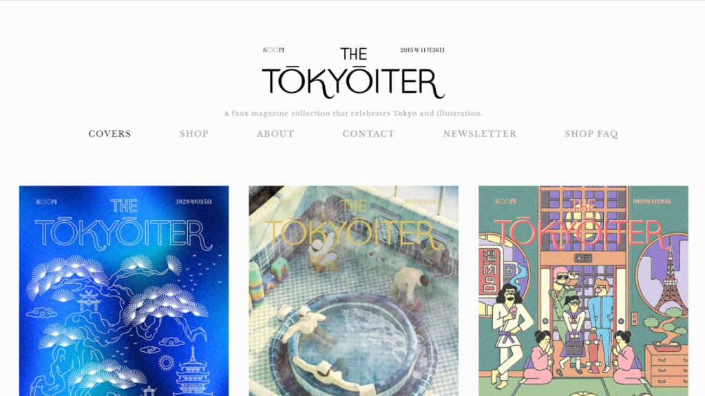
Design your website layout in a way that highlights your art and makes it easy for visitors to navigate.
This site has a simple, clean but stylized design that looks similar to an instagram feed.
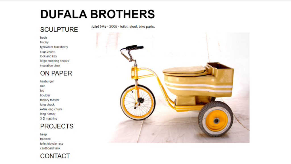
Typography
Select fonts that are easy to read and reflect your artistic style.
Images
Use high-quality images that showcase your art and create a visual impact.
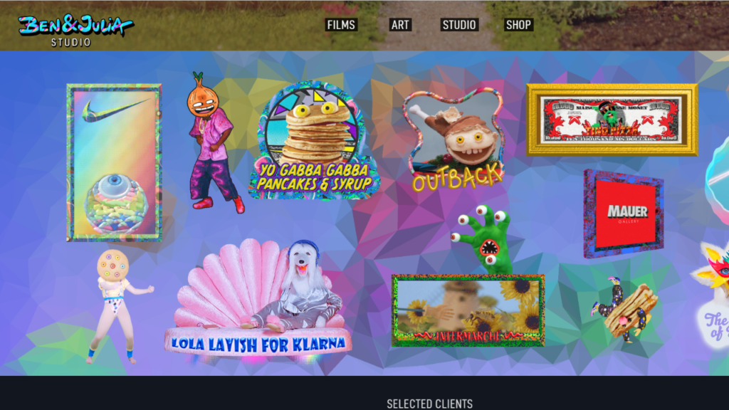
By connecting your art and web design, you can create a website that truly reflects your unique vision.
Layout Design Inspiration
As an artist, you know that the layout of your website can make or break the user experience. Here are some layout design inspirations that can help you create a website that is both visually appealing and easy to navigate.
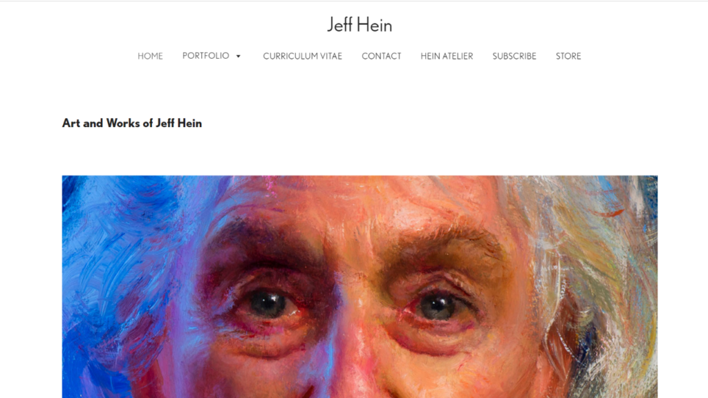
Minimalist Layouts
A minimalist layout is a design approach that emphasizes simplicity and functionality. This type of layout is perfect for artists who want to showcase their work without any distractions. Here are some characteristics of a minimalist layout.
Clean and simple. Easy to navigate but the art speaks for itself.
Grid-Based Layouts
A grid-based layout is a design approach that uses a grid system to organize content. This type of layout is perfect for artists who want to showcase their work in a structured and organized way.
This type of site has consistency and symetry.
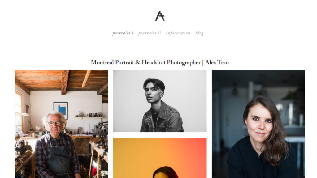
https://alextranphotography.com
If you’re looking for more website design inspiration and guidance to create your own site, analyzing other sites is a huge help. My advice would be to start with your messaging and map out your pitch first. Make sure you’re speaking to your ideal customer and giving them all the information they need to set up a good impression.
Then, have fun with your design and have fun creating your style around that!


0 Comments